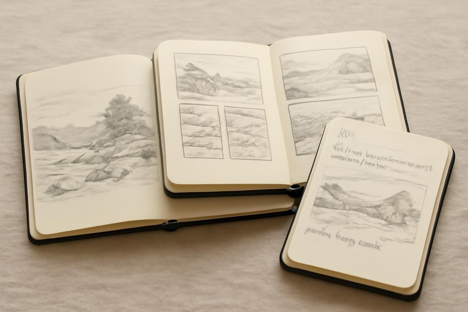
Portable Setups: Pocket Sketchbook Layouts Compared
Why layout matters
How you organize a small sketchbook affects what you record and how you return to pages later. A single large drawing encourages focus and commitment; thumbnails capture many observations rapidly; annotated spreads combine image and text for memory and later reference. This note compares three common pocket layouts and suggests when to use each.
Single-image spreads
This layout reserves one page for a single subject or view. It is useful when you want to invest attention in proportion and value without the distraction of adjacent sketches. Single-image spreads are good for studies you might revisit for larger work.
Benefits:
- Room for careful observation and larger marks.
- Clear visual hierarchy when scanning or flipping through the book.
Limitations:
- Takes more time per page, so you record fewer instances in a session.
- Can encourage overworking small pages in search of perfection.
Multi-panel thumbnails
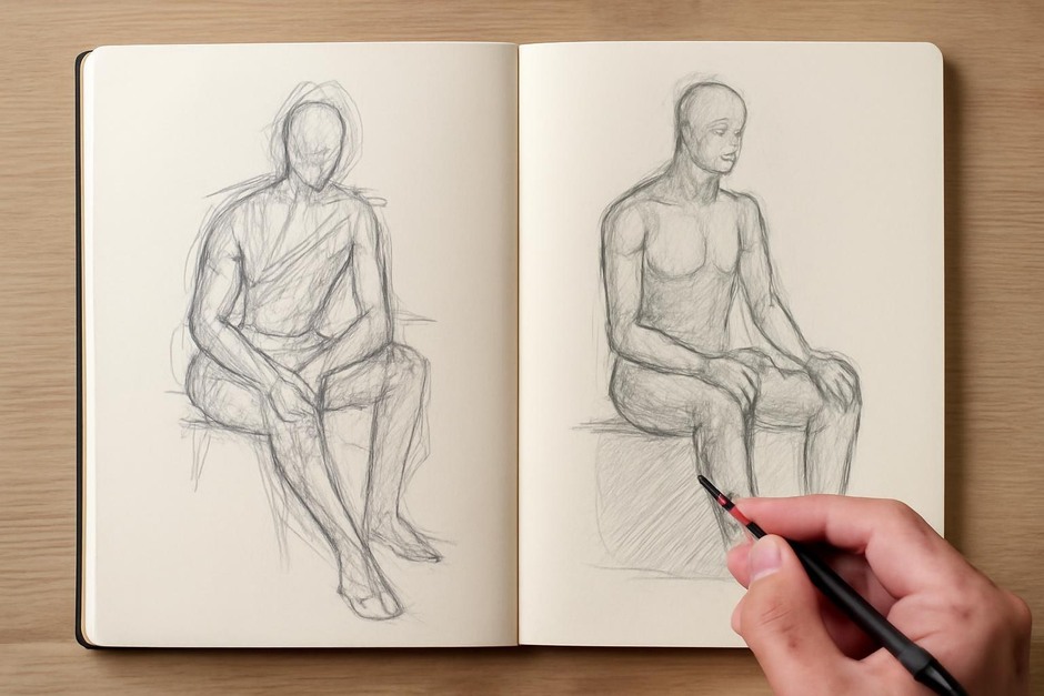
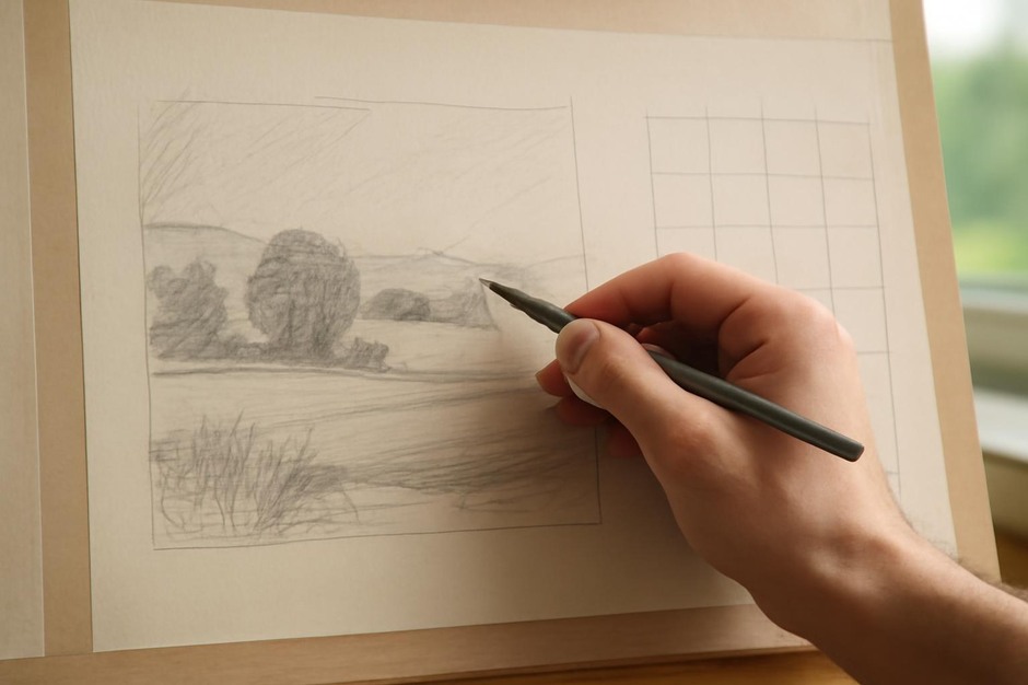
Dividing a spread into several small boxes or panels lets you capture many moments quickly. Thumbnails are excellent for testing compositions, recording sequences of movement, or sampling light over changing conditions.
Benefits:
- Fast capture of variety—many ideas per page.
- Low pressure: each mini-sketch can be rough and experimental.
Limitations:
- Small size can obscure fine detail and subtle values.
- May encourage superficial seeing if used without occasional slower studies.
Annotated spreads
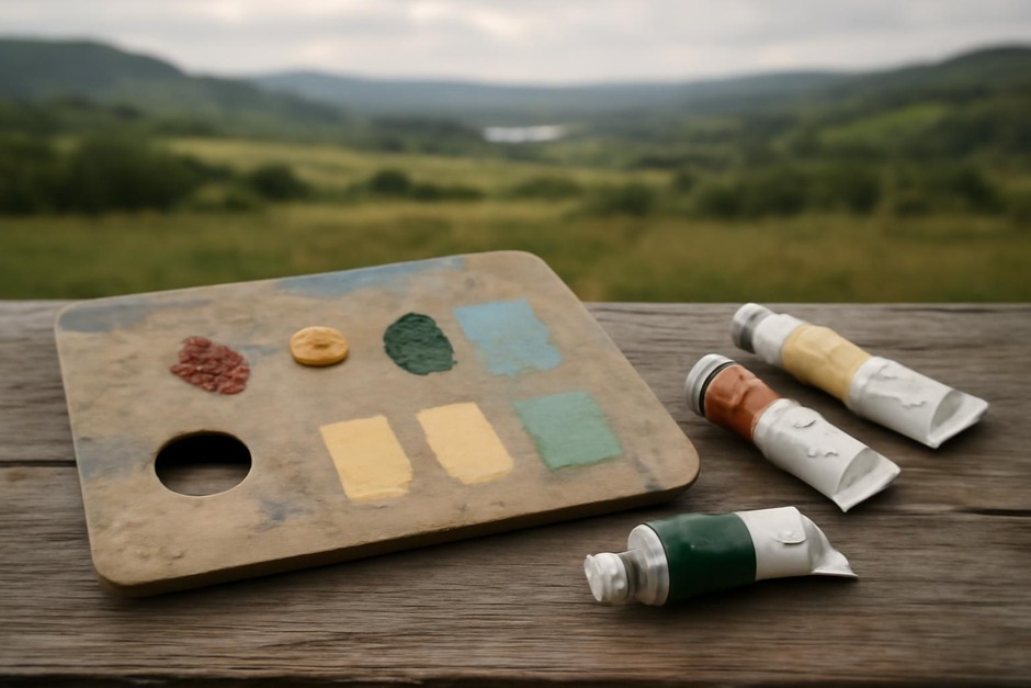
Annotated spreads combine imagery with short written notes: colour observations, measurements, or thought fragments about the scene. This layout supports memory and later studio use because text anchors decisions that a sketch alone might not record.
Benefits:
- Combines visual record with contextual information.
- Useful when making decisions about material, colour, or lighting for later work.
Limitations:
- Writing can interrupt flow if you prioritize legibility over speed.
- Pages may become cluttered without a clear visual plan.
Choosing a layout by intention
Select a layout based on what you aim to learn. Choose single-image spreads when you want careful study of form or proportion. Use thumbnails to explore composition, gesture, or changes over time. Add annotations when you need to remember colour, weather, or a specific detail that a drawing alone might not capture.
Combined strategies
Many practitioners switch within a session: start with two or three thumbnails to survey options, select one thumbnail to expand into a single-image spread, and annotate the final study with brief notes about palette and timing. Such sequences keep the sketchbook flexible and multi-functional.
Layout is a tool. Treat it as a decision that aligns with what you want to see and keep. Over time you will develop a few favorite structures that suit your rhythm and the typical conditions you sketch in.